Microsoft Power BI presents data from Business Central graphically, as shown here:

The remaining pages of this blog discuss (a) extracting this data and (b) using Visualizations to present the above report for end users and stakeholders.
Seeing Business Central expressed graphically allows for better understanding of its data and emphasizes the usefulness of Power BI.
Extracting Business Central Data
From the “Home” tab of Power BI Desktop, take the following steps:
- click “Get Data”,
- choose “More”,
- select “Online Services”,
- pick “Dynamics 365 Business Central”, and
- click the “Connect” button:


Within the “Navigator” window, find the production instance of Business Central:
 After selecting “Web Services (legacy)” within the company database, click its checkboxes to choose the following three tables:
To properly join these tables, choose the “Model” button on the lefthand side of the Power BI Desktop (three boxes with workflows):
![]()
And, join these three tables as shown here:
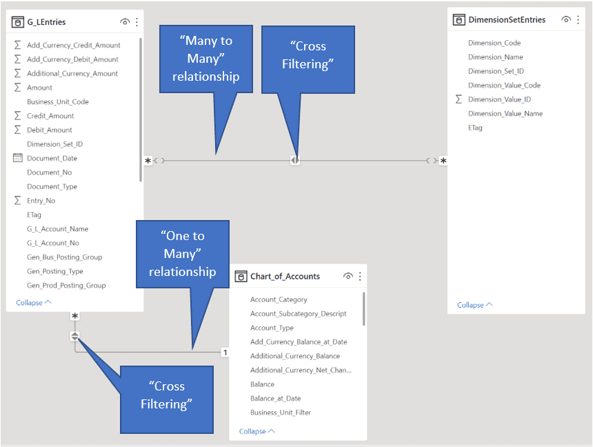
A Many to Many relationship exists between the “G_LEntries” and “DimensionSetEntries” tables based on the on “Dimension_Set_ID” field.
Of course, the “G_LEntries” and “Chart_of_Accounts” tables are joined within a One to Many relationship based on the “G_L_Account_No” and “No” fields respectively.
Using Power BI Visualizations
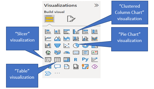
The “Visualizations” panel on the righthand side of the Power BI Desktop displays the visualizations used in this report. The remainder of this document outlines the properties of each Visualization.
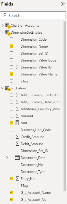
Slicer
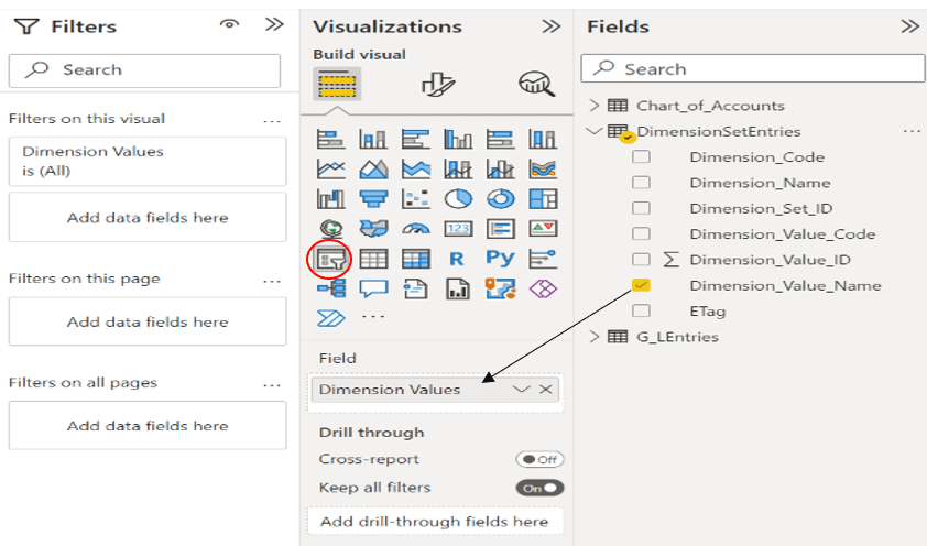
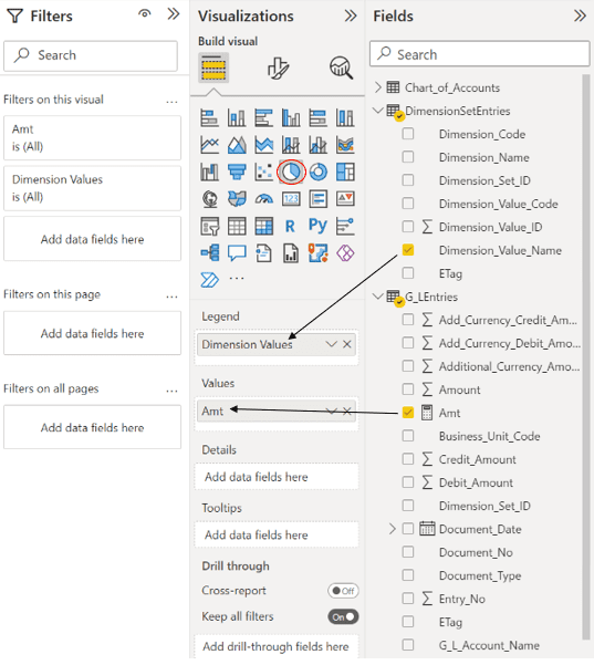
After dragging the “Dimension_Value_Name” field into the Slicer Visualization, the field was renamed to “Dimension Values” as shown above.
The final page of this document displays the formatting of the Slicer.
Pie Chart
Clustered Column Chart
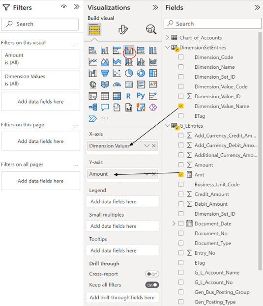
After dragging the “Amt” field into the Clustered Bar Chart Visualization, the field was renamed to “Amount” per the screenshot above.
The following formula was used to create the “Amt” field used in this and other Visualizations:
Amt = SUM((G_LEntries[Amount])) * -1
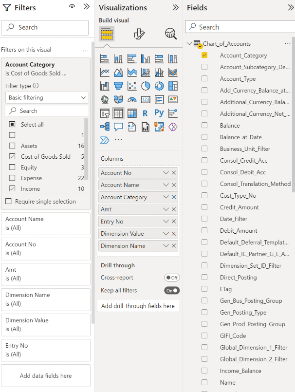
Table (Summary)

The red circle above shows how filtering of the “Account Category” field of the Chart_of_Accounts table was conducted for Cost of Goods Sold and Income accounts.
The screenshot at the top of the next page shows the fields, from the G_LEntries table, used and renamed in this Table Visualization.
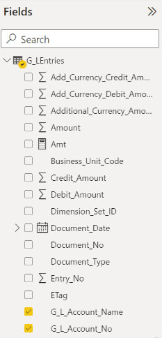
Table (Detail)
Here are the fields from the “DimensionSetEntries” and “G_LEntries tables” used and renamed in the detailed Table Visualization displayed on the previous page:
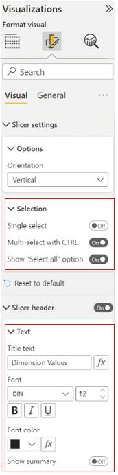
Formatting of the Slicer
For more information about Power BI and reporting customization please reach out to us at Support@BondConsultingServices.com or schedule a free consultation with one of our experts by clicking here!